Gold
#D4AF37
Our visual identity brings together Pacific warmth and Nevada character.
The founder-supplied brand direction: warm Pacific Northwest hospitality, gold and cream, with teal and evergreen accents.
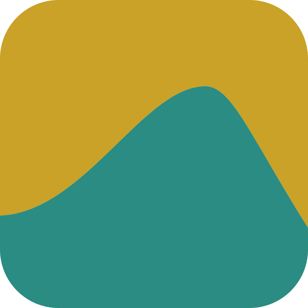
Our chosen logo direction is called “Turn it over.” Upright, its curve suggests a Nevada dune. Turn it through 180 degrees and it becomes a Pacific wave.
That connection brings our Nevada-first focus and Pacific Northwest inspiration into one simple mark. The rounded tile gives the curve a clear, compact home—from the website to an email signature.
We pair gold with warm cream to express the welcoming, considered feel we want for Pacific Cab. Teal carries the wave through the identity, with evergreen and charcoal supporting clear, readable communication.
The original logo artwork uses gold #C9A227 and teal #2A8C82. Our website and email palette uses gold #D4AF37 with warm cream #FBF3E4, preserving the original mark while giving the wider brand a softer setting.
Our name is Pacific Cab. Cybercab describes the vehicle opportunity we are exploring; it is not our company logo.
#D4AF37
#2A8C82
#FBF3E4
#1F4D3A
#EDE0CC
#1F1F1F
Space Grotesk for headlines. Inter for body copy. Speak plainly about what we’re preparing, without promising a launch date or suggesting active service.
Warm sand backgrounds, natural expressions and consistent head-and-shoulders framing.
View founder portraits